Our Design Process
Here at DETO BRIXEN we’re always thinking of ways to make you look fresh when you’re out there doing you. Being comfortable is just as import as a dope design, which is why a lot of our clothes are made from ring-spun cotton and polyester. In this post we’re going to focus on the design process. We usually pull from a number of DETO BRIXEN artworks and ideas. We have a tendency to center around The Changer/Doubt Bringer Paradigm, Strange Birds and Fantastical Animals, Skulls and more. Most of the artwork on our clothing and apparel tells a story of being true to oneself and to keep on pushing. To hold doubt at bay and not to let it seep into your thoughts and gum up the works. This is about progress through the process of innovation and exploration.
Below is a 5 step design process for the Brain Crabs 3/4 Sleeve Tee.
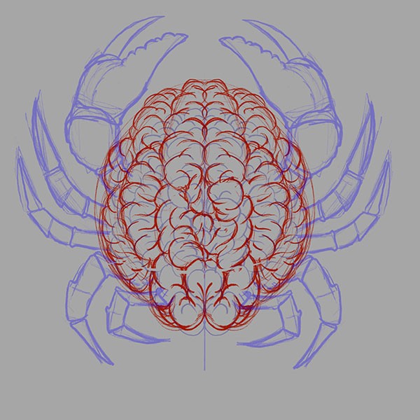
1. Sketch out the idea
This started as an exercise in drawing brains. Human brains to be exact. The initial sketch had the hidden element that was intended, but needed something a bit more… interesting. After looking at the shape of the brain sketch there was a moment of, “what if it had legs?” Yes, it definitely needed legs, but legs we haven’t already seen protruding from a brain, it needed to be different, it needed to be fresh and it needed to be Northwest. Enter the Dungeness Crab. The native purple tinged, grayish-brown crustacean and local delicacy. Dope! That’s what we are going with. Let’s throw some crab legs and pinchers and hit the ground running.
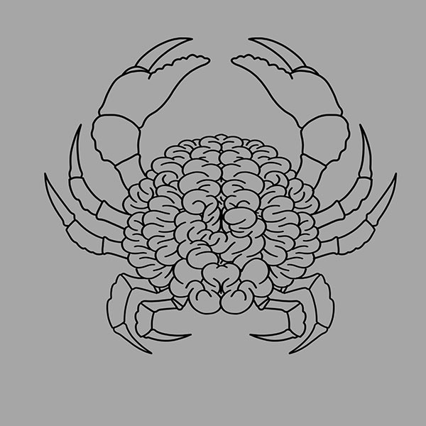
2. Solidify the line art
Taking this sketch and refining some of the proportions, especially to the shape of the brain to more closely resemble that of a crab, we were ready to move into the line art phase and work out all of the larger detail.
3. Fill color and details
Now it is time to drop in some color to see the silhouette to make sure it is readable from a distance. Then add in some cross hatching and details to create some volume to the brain tissue and appendages. Having started on a mid value background really helps in this stage of the design.
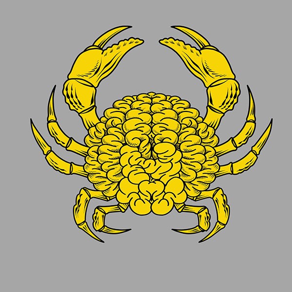
4. Apply final details and shading
The next phase is adding the final hues and painting in some shading and highlights to make the parts of the brain crab really pop. The intent was to keep the color palette interesting and eye-catching. Some areas are lighter than others to really draw your eyes to the hidden symbolism. Were you able to spot it?
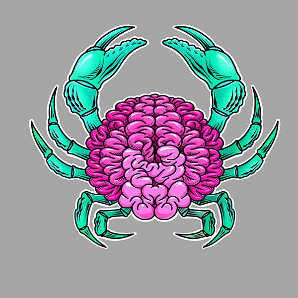
5. Final Format
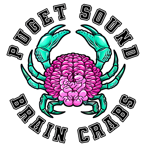
For this design, something had to make it a bit more exciting. A stationary, symmetrical graphic can only push a design so far. This needed something a bit more interesting to round things out and really push the look. But what? How about words. Words on garments go together like crabs and water, like brains and skulls, like… well you get the point. Coming from the Puget Sound area and having this printed on a ¾ sleeve, we made up a fake sports team that we would totally root for and call it good.
If you enjoyed reading about Our Design Process, check out our blog for more posts

Got that new?
If you like cool stuff like this and want to see the latest streetwear before everyone else, show some love with the Brixenaut Sign Up. – Don’t forget to follow us on Insta.
